6 Successful Facebook Ads to Copy
This is a post that I’m excited to write! We’ve created lots of ads for our clients, and I’m going to show you 6 successful Facebook ads and how and WHY they work. I’ll also show you the techniques that are important.
BONUS: I have a 5 part Facebook Ad Template that I give away for FREE. If you like this post, I recommend you download it now, because it’s what this post is based on and goes into LOTS of detail.
You can copy these ideas and techniques to help create successful ads for your own business. I’ll go over ads for service businesses, e-commerce/physical products, and digital products – so no matter what kind of business you are in – you will be able to find some inspiration.
Important: In all the client ads I’ll show you, I’ve blurred out identifying information to protect the identity of our clients.
Ad #1. Interior Design Firm
The first question that you need to ask when you are putting together a Facebook ad is “What should I be offering in my Ads?”
Most people don’t ask this question. I almost never see this question in my Facebook group or on my You Tube channel. And that’s a mistake. Because it’s the most important question to ask.
Figuring out your offer is more important than your targeting, or your ads manager settings, or any single technique.
Pro Tip: The MOST important thing with any Facebook Ad is offering something that people ACTUALLY want.
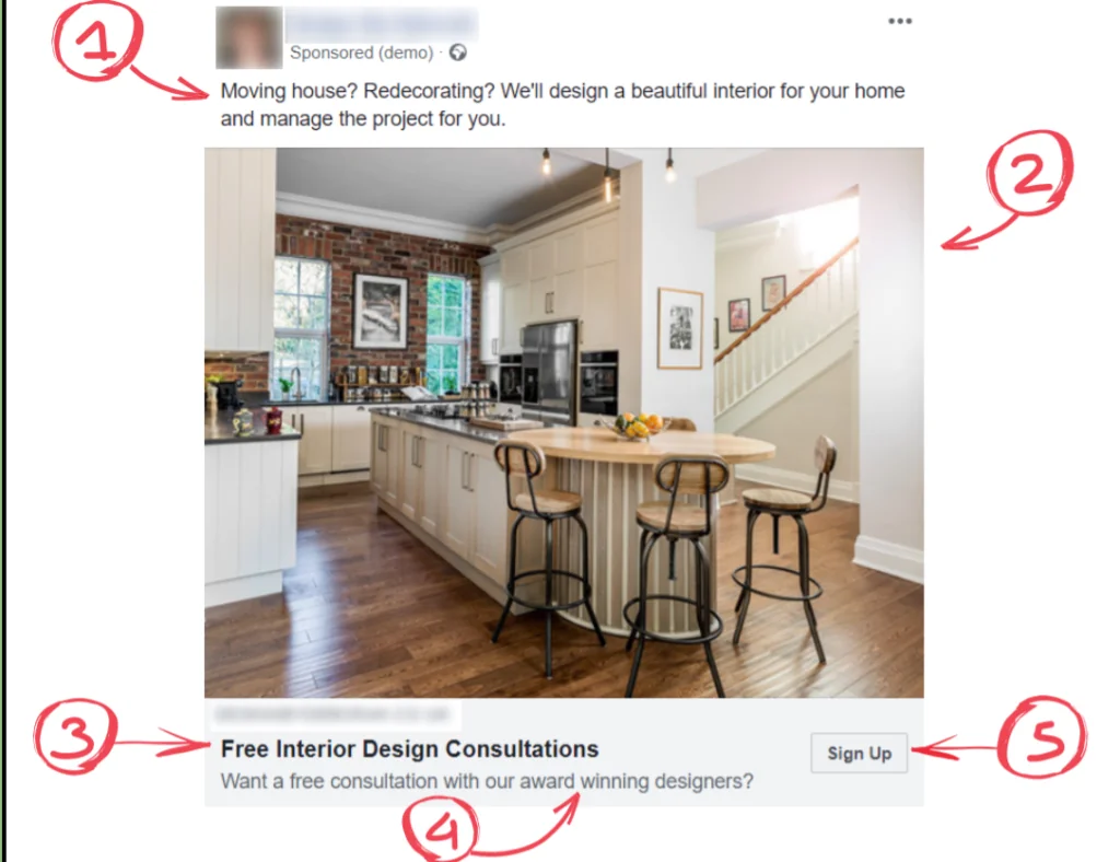
In this case, we’re dealing with an interior design company. They want interior design clients. So you can see here they are offering free interior design consultations.
How this offer works is that one of the designers from this company will go out to the property and they will take a look around and see what needs to be done and make recommendations. The goal is to move people from the free consultation to becoming a full client.
Tip: Many service providers are worried about the cost or time involved in giving away a free consultation. The answer to this is often to raise the price of your full services in order to be able to offer a free quote, a free consultation or a free training session.
That way people can test out your service in a very low risk way.
The difference between offering something like a free consultation and just saying “We’re interior designers” is ENORMOUS.
When an ad pops up in your Facebook feed, what you typically will notice first is the image. It’s important to choose your image wisely.
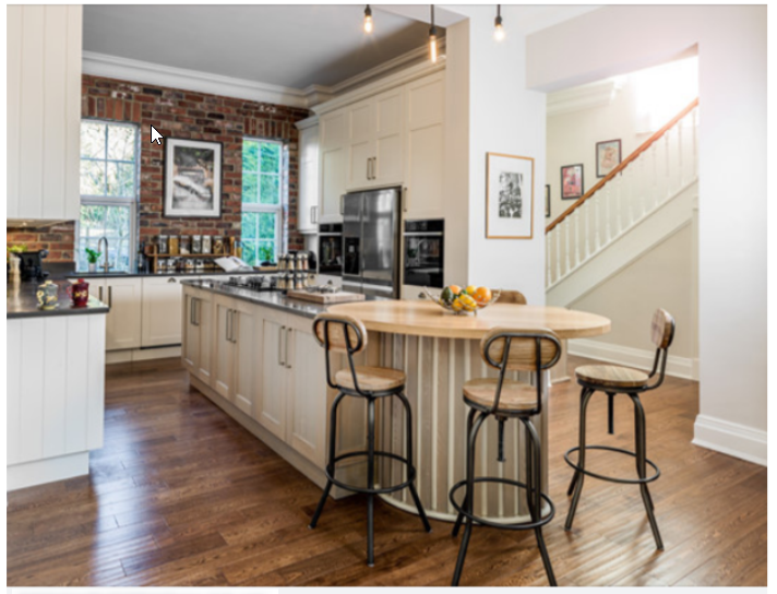
This image shows off a very nicely designed kitchen that this particular interior design company did. If you are a company that has a portfolio of client work then you want to include some of your best images in your ad. Just make sure you have the correct permissions to use them.
TIP: People like to see what they are buying. If you have a visual service like interior design, graphic design, photography, or even a salon, then including your best images can greatly improve your results.
Now it’s time to look at the copy of the ad. You see where the number 1 is? That’s where we’ve used what is called the “Call-out method”.

These questions at the beginning of the copy will catch people’s eye if they are indeed moving house or redecorating.
Immediately after the questions we follow up with a few benefits of the service – “beautiful interior and we’ll manage it for you”.
Think about what the BIGGEST BENEFIT of your service is and make sure you include that in your ad.
“We’ll manage it for you,” is a huge benefit. It means no stress and no hassle for the homeowner.
Since this is a low risk introductory offer you don’t need reams and reams of copy. Just let them know what to sign up for and that it’s free and there is no obligation.
The goal is to start the conversation and then progress it from there.
Ad #2. Personal Trainer
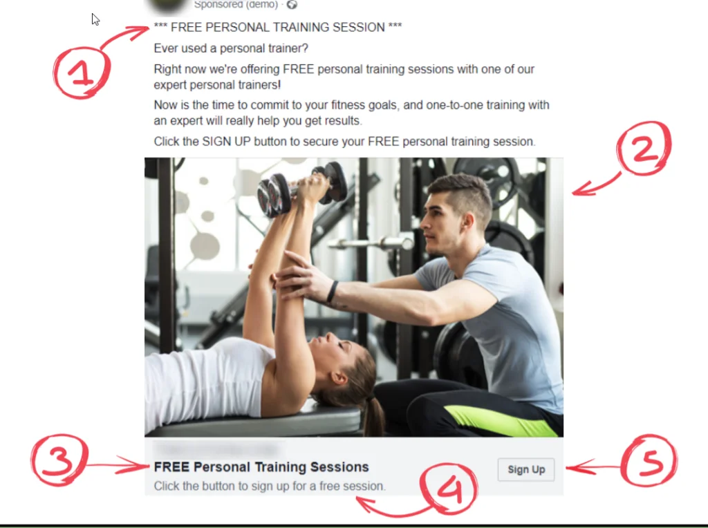
This ad was for a local gym that has several locations. They wanted to get more people in their personal training programs.
So, coming back to what I said earlier about the offer being super important, the very first thing we decided was that we’re going to offer a free personal training session.
This helps people “take the leap” to trust the business. If they have a good experience the first time, then they are more likely to book paid sessions.
I’ve seen a lot of business owners reluctant to give these kinds of offers. But we work with dozens of companies and run many, many Facebook campaigns. The offer is the most important part of the campaign – by FAR.
If you can offer something for free to demonstrate how good your service is or how good your personal trainers are then many people will take you up on that offer and go on to become paid customers.
You’ll see the headline here is VERY simple.
We are telling people that they can get a free personal training session. In this case, we put it in all caps to really grab the readers’ attention.

In this ad we actually didn’t use an image from the client. We used a simple and attractive stock image from Facebook’s partnership with Shutterstock.
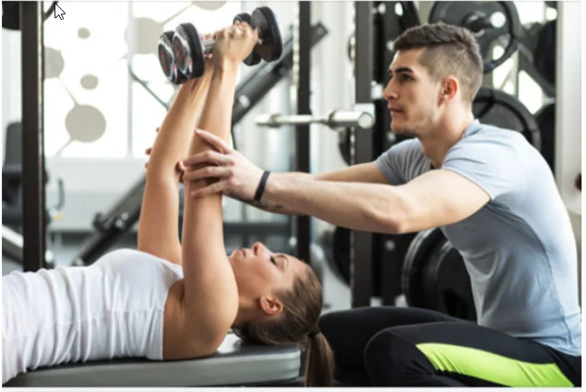
These images are free as well. As long as it’s a high quality image and directly related to your campaign it’s likely to work.
Tip: To access Shutterstock images on Facebook, when you are adding the image click on the “stock button” at the top so that you can browse the options that might work for you.
If you do have your own images, they will often work better. But if you don’t, then the Facebook stock images can be a good way to go.
Back to the copy again. It’s pretty straightforward and we’re using some similar tactics. Although we’re not using the call-out method here, we are really grabbing the attention of people who might be interested.

In this ad the goal is to find people who haven’t used a personal trainer. So, the question – “Ever used a personal trainer?” – is meant to find people who haven’t, but may WANT to use a personal trainer.
Then we explain the offer in a bit more detail and emphasize the expertise this company’s personal trainers have.
Next, we include a benefit about meeting goals and getting results.
Finally, we have the call to action, telling them to click the sign up button.
Here is the formula:
- Identify the sort of people we want to pay attention to this ad
- Emphasize the benefits the service provides
- Have a call to action so they know what to do
Now that we’ve covered service providers, lets move onto another type of business: e-commerce.
Ad #3. Online Bakery
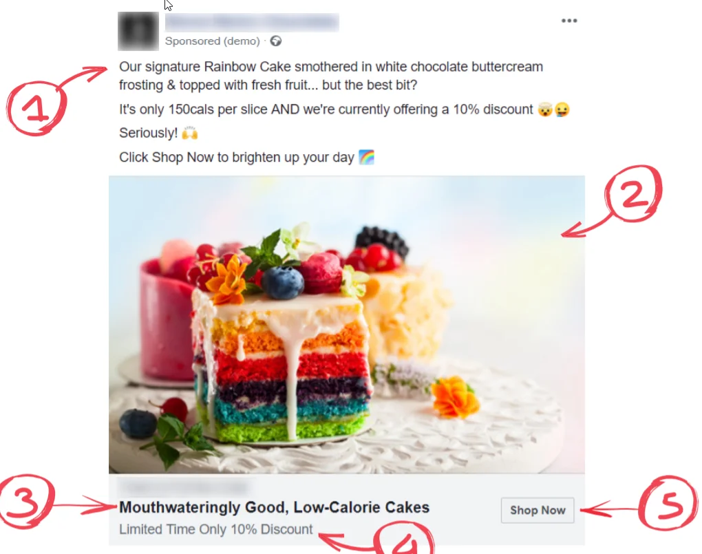
Here’s an ad that is very similar to one we’ve run for a company we work with. We did modify it a bit so as not to demonstrate the company’s actual information.
The first thing I want to point out is to use an image that is very colorful where possible. I’ts a great way to grab people’s attention. This image does a GREAT job of grabbing attention.
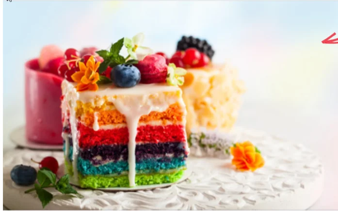
It’s also very emotive. Anything food related should be very visual as you want people to be interested in it and make them feel hungry.
Next is the copy.

This headline is interesting, because it uses two competing desires to create interest. People will be interested in low-calorie cakes. They will also be interested in mouthwateringly good cakes. But… since those two things don’t always go together it creates curiosity – they will want to find out more.
We’ve got some more information up here in the copy:

You’ll see the description makes you want to taste the cake, and the benefit is on the second line – ONLY 150 calories!
We’re using lots of happy emojis in this ad and highlighting the limited time discount. Discounts – even small ones – can really boost the results of your campaign. You have to make sure you build it into your margins, but it can make a real difference.
Then of course we finish with a call to action, “Click Shop Now to brighten up your day.”
Pro Tip: The tone of your copy should match the tone of your product. If you are selling a serious high-ticket item you need to be more serious, but for something fun like a rainbow cake your copy can be fun and playful.
Ad #4. Online Shoe Retailer
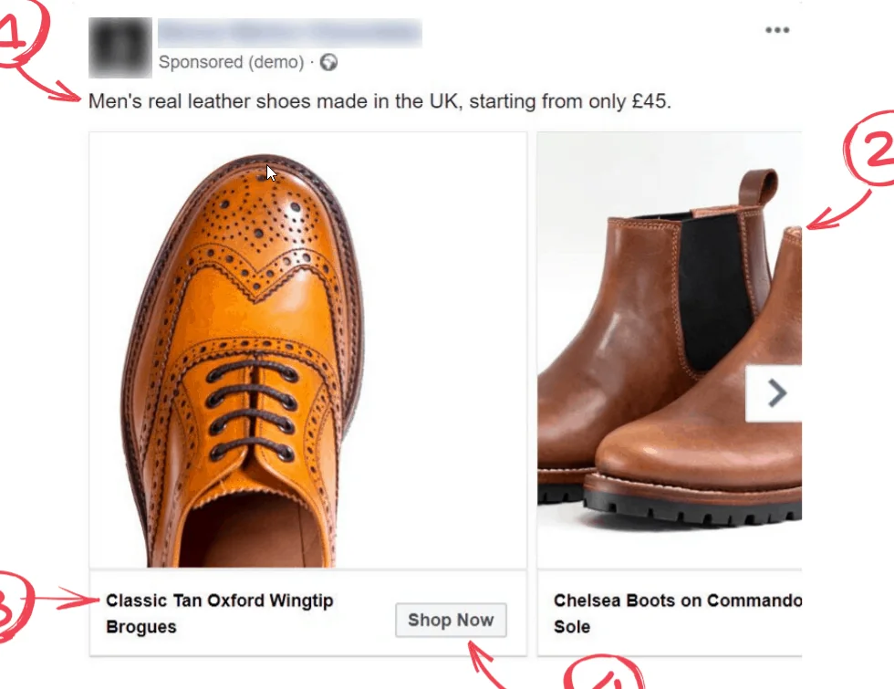
This ad is for an online shoe retailer. We’ve used a carousel based ad, which can be a great option with e-commerce companies.
Carousels allow you to create cards that feature separate products. These cards are interactive. You can click the arrow on the side and scroll through various options.
This has some serious advantages. Instead of paying multiple times to show a bunch of different items, you can advertise once and show all these different products and people can choose between the different options.
Here are the different cards in this particular carousel:

We normally have 4 or 5 different products in a carousel, and people can scroll through them.
You want to include your best, most compelling images of your products and try to make them fun and interesting like we’ve done here. You’ll notice that we have shoes facing different directions and different angles of shoes. This kind of variety keeps attention on the product images.
Because people can scroll through the products, it’s important to keep your benefit generic to the line of products that you are showing.

Because of this we keep the copy very, very short in a carousel ad. We’ve also found that this works best for carousel ads.
Then the photos themselves have just a brief product description and a shop now button that takes them to that particular product page.
Pro Tip: The BIG key to making carousel ads work successfully is to find the right combination of products. This often requires some testing of different types or groups of products.
Another BIG benefit of carousel ads is that they are great at increasing your average order value. People may see a couple of pairs of shoes, so when they click through they might buy multiple pairs that they liked the look of.
This is important to remember with carousel ads, because the cost per purchase may be higher, but the overall value of each order also may be higher – which can make the campaign more profitable.
Now that we’ve covered service based businesses and e-commerce, it’s time to cover digital products and services.
Ad #4. Facebook Ads Agency
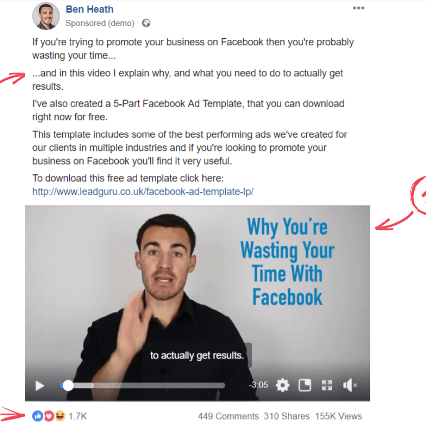
This is an example from my own company. Our primary service as an agency is Facebook advertising services.
To get people into our funnel, we give away free information, like our 5 Part Facebook Ad Template – you can pick that up here if you want to take a look at it.
The 5 Part Facebook Ad Template is a free resource for business owners that only requires an email address to get access to, so it’s a very low risk offer for the end user.
In this ad I use a Facebook video ad. I like to use Facebook video ads all the time, both for my own ads and for my clients ads. There are lots of good reasons to use Facebook video ads, especially if you have a service that needs a little bit of explanation.
But I don’t want you to think that video ads are the ONLY way to advertise. For many products and services static images or carousel ads – like we’ve gone over above – work just as well or better.
The reason that I use video here and the reason it works so well is that in order for people to want to download my five-part Facebook ad template, they need to know that I know what I’m talking about with Facebook ads.
The need to know I’m an expert and I can demonstrate that with video.
Another important thing to note here is that our average customer is worth tens of thousands of pounds to us. So even though it’s often more expensive to generate a lead with video ads, these prospects are more qualified and more likely to engage our services in the future.
So, it’s worth it for us to pay more for a more qualified lead.
Pro Tip: If you are trying to present yourself as an expert, putting together video ads is absolutely worth the time investment and expense.
Now, let’s take a look at the ad itself.
The first thing I want you to notice is the very first line of copy we are using talks about people wasting their time by promoting on Facebook.
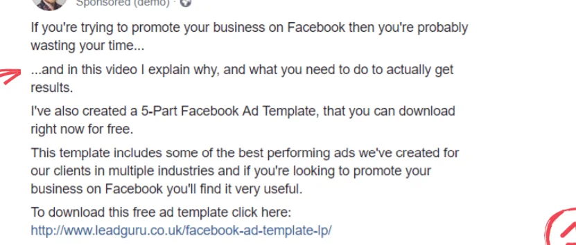
We KNEW this would grab our audiences attention, and it did. We use it both in the copy and in the thumbnail of the video:
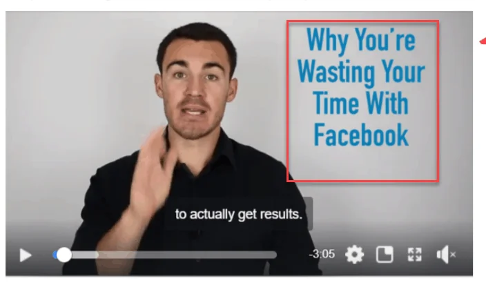
In the first part of the copy, I’m grabbing their attention. And in the second part I’m explaining the benefits of watching this video. Because that’s what I want people to do.
In the copy I’m also trying to convince viewers to stay and watch it to the end.

Then, of course, I include a call to action with a link:

It’s important to tell people what action you want them to take and this can really help improve your results.
So this basically follows the same formula as the other ads: an attention getting headline, explain the benefits, and a call to action.
Of course before any of that, the offer has to be good. My free Facebook ad template is a really good offer that provides a ton of helpful information.
Ad #6: Remote Services
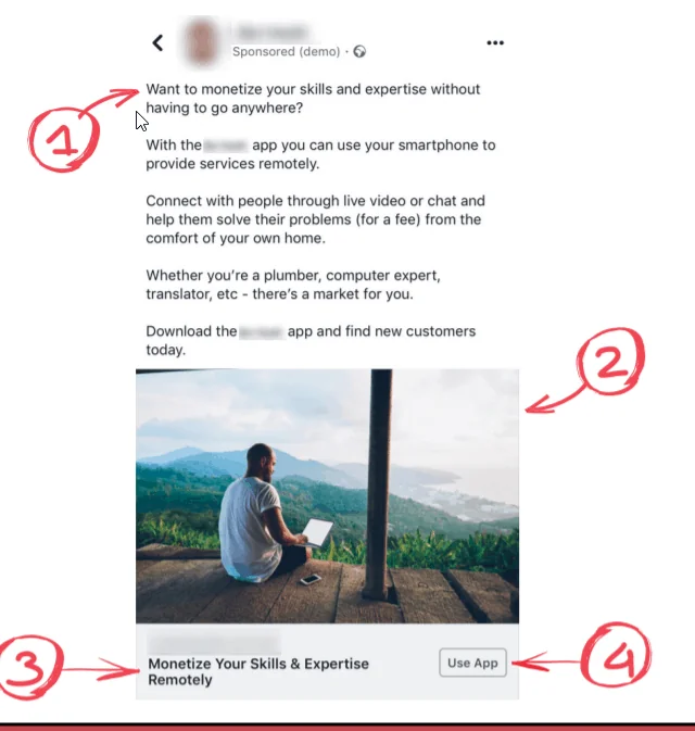
This ad is for an interesting app based service. It lets people monetize their skills remotely.
This app clearly has two sides – one is finding people who need services. The other is finding people who want to provide their services.
This particular ad is designed to find people who want to provide their services.
You’ll see the headline here:

This headline is benefit rich, and if you have skills or expertise that you want to monetize, it’s going to grab your attention.
But the offer here needs more explanation. So we use fairly long form copy for that.
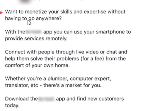
This copy is also VERY heavily benefit driven. Who doesn’t want to make money with their skills without having to go anywhere? The copy also goes into more detail about the offer.
And includes a call to action.
The image here is also very important. It shows what is typically called “the laptop lifestyle.”

The image is very idyllic and brings up a lot of positive emotions.
So, were explaining the offer. We’re explaining how it works, and we’re showing them what they should do next.
Another thing this copy does very well is it addresses some concerns and overcomes objections right up front:

People who are plumbers or do other on site services may not think there is a market for them, so this addresses that right away in a positive manner.
There you have it, those are the 6 ad examples in detail.
Video Training: 6 Real World Facebook Ad Examples to Use
In this video I break down each of the 6 ad examples above and give you explanations for why they work.
The Bottom Line of Facebook Ads That Work
In my experience most high-performing Facebook ads start with an offer that is compelling. The offer is the MOST important piece and it’s worth taking the time to really think through your offer and how it fits into your sales funnel.
Next, the ad should contain these main parts:
- The copy should identify the sort of people you want to pay attention to your ad
- The copy and the image(s) should emphasize the benefits your product or service provides
- The image should be eye catching and attention grabbing
- The ad should have a call to action so people know what to do next
Successful ads almost always have these parts in common, and it’s a good idea to model these elements.


