How To Create Facebook Slideshow Ads That Convert!
There are a ton of ad formats on Facebook, and it can get confusing to know which one to use and in what circumstance to use it.
That’s why, in this article, I’m going to show you how to create Facebook slideshow ads and in what circumstances you should use them.
Why Use Facebook Slideshow Ads?
Slideshow ads are a way to take boring static images and add some movement and extra text overlay so that you can highlight the benefits of the product or service that you’re advertising.
They can REALLY help to grab your audiences attention and improve the results of your Facebook advertising.
As a Facebook advertising agency we will often test single image ads against slideshow ads and it’s not unusual for us to see better results with a slideshow ad.
The good news is that slideshow ads are relatively easy to create.
Creating a Facebook Slideshow Ad
NOTE: If you are brand new to Facebook ads, I would recommend you check out the post “How to Post an Ad on Facebook” first, and then come back and read this post. The above post will go over all three levels of set up – campaign, ad set, and ad level.
We are going to go straight into the ad level of Facebook ads in this guide, because that’s where a slideshow ad is created.
When you are at the ad level, you want to select the single image or video option.
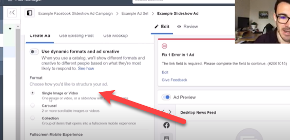
This is a little bit misleading, but if you look at the fine print under the bold you will see it does say “or a slideshow with multiple images.”
The big advantage to slideshows over videos are that they are MUCH easier to create. You only need images – not some fancy video studio and editing software.
To get started click on the “create slideshow” button.
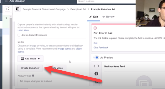
When you click this button Facebook typically displays some examples on the right hand side of how a working slideshow functions.
Once you get into the interface, have a look at the Facebook templates that are already provided to you.
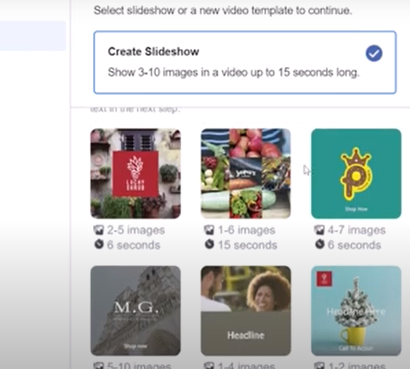
Each template will tell you how many images are displayed as well as how long the slideshow lasts. The time and images vary on each slideshow.
Generally speaking, most people will display images around a related category of products or different images around one product that represents a large purchase – like a car.
If you are doing images around a single product, then you want images that show off all of the products features.
Pro Tip! The lower the price point and the more general appeal your product has, the shorter your slideshow can be. For more expensive products that need more customer consideration, you will want to use a longer slideshow and have more images.
Next you want to choose a pre-set or template. In this example, I’m going to choose a super simple preset.
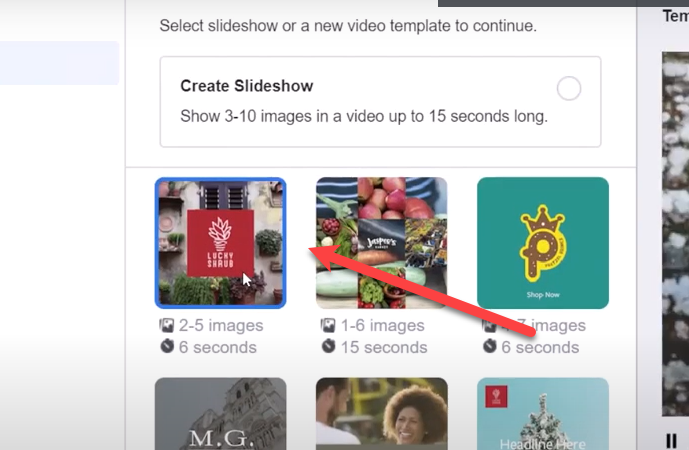
Tip: If you don’t like the presets and want to play around with it you can also click the create slideshow button and do it manually. I do recommend the templates, because they look cool, are professionally designed and easier for most people to execute.
You can hover over each of the templates and Facebook will show you what they think you should use that template for. You don’t have to use them the way they suggest, but it’s a nice feature that I wanted to point out.
Advertising a Service with Facebook Slideshow Ads
In this example we are going to assume I’m advertising a service and choose the “showcase a square image” template.
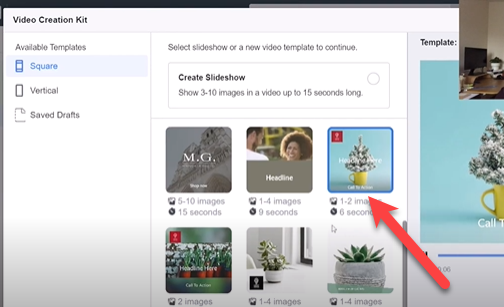
This template actually only uses 1-2 images, but it IMPORTANTLY allows me to use a text overlay, which is very hard to do any other way in Facebook. Most of the time if you put text on images it dramatically decreases your reach.
Once you click on the interface, you will come into this interface:
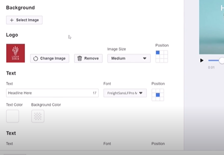
The first thing you want to do is select your image. I’ve got a bunch of different images here, but lets say for example that you want to advertise tennis lessons.
I would select my tennis image either from my images or from Facebook’s stock images.

Even though I’m only using 1 image and this is a service, it can work very well with the Facebook slideshow format.
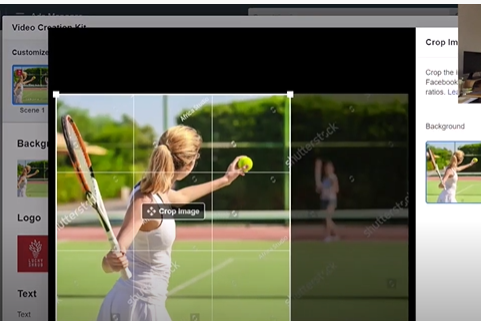
Now what we have is an image, that I can then crop so that the most dynamic part of the image is showing.
Next I can add my logo and move it around the screen (for a demo go to 22:00 in the video below).
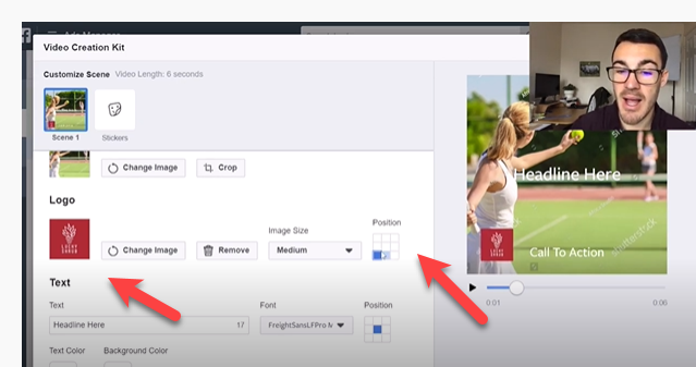
Then you get into the text. And this is where the magic happens. In normal Facebook ads they don’t like a lot of text, but in these slideshow ads – even if it’s just one image Facebook encourages text overlays. This is a REALLY big deal.
You can choose what you want to say and also put in a background color to make your text stand out from the image more.
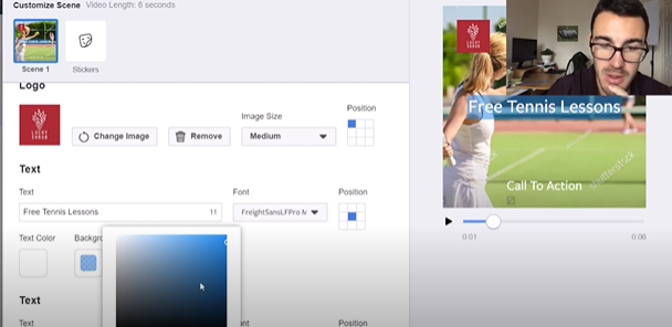
You can also change the text color and the position of the text.
The next box is for the call to action text. Ads almost always work better if you tell people exactly what to do and I quite like that I can put that directly on my image here.
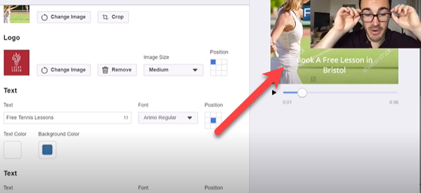
The idea here is to “call out” your ideal audience. In this case, if you are giving tennis lessons in Bristol, then you want to call out your audience in Bristol. That’s so when people in Bristol who might be interested in tennis see your ad, it catches their attention.
The goal here is to catch people’s attention so that they can take action on your offer and to use the text overlay feature to get text in your ad.
Advertising Products with a Facebook Slideshow Ad
The next example is selling a range of products using a Facebook slideshow ad.
I’m going to select the template that is designed to sell multiple products.
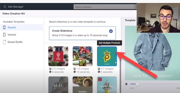
Now there are four scenes in here, and they will each need a background image. You want to feature your best product shots here. For this example, I’m using random images from this ad account. You’ll want to make yours relevant to the product or service you’re offering.
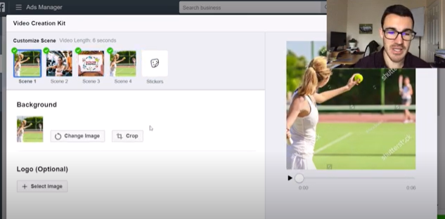
Next you want to add in your text and choose a background color to make it pop out.
You can do this for every scene in your slideshow.
You want to use the text area on each slide to call out the benefit of your product. Something like “Free Shipping on All Orders” or a sale if you’re running one.
Important Note: Different campaigns often work best with different ad types. I would test a slideshow campaign against a single image and carousel ad to see what works better.
The best part about this is that as it goes through the feed, the images move, which helps to catch people’s attention.
You can see how it works at time 15:00 in the video below.
The next step is to decide which placements you want to use. Personally, I always get rid of the vertical and just use the square version in Facebook and Instagram feeds.

Then I deselect stories in my placement options. Otherwise you need to create vertical ads that can be used on stories to make them look better.
The last step is to click “Use Video” and then you have your ad ready to go. All you need to do is add text that applies to the entire slideshow to the ad and hit publish.
Tip: Once your slideshow has been created you can’t edit it. You can create a new one. It’s a good idea with slideshows to take your time and get them right before you hit “use video.” Otherwise you have to start all over.
Get More Facebook Ads Training!
There is nothing I like better than to see business owners increase their ROI with Facebook Ads. In order to help business owners succeed with Facebook ads I’ve created a FREE webinar training that you can register for here.
When you attend this webinar you’ll learn:
- 3 different Facebook ad strategies that we use every day. These strategies have generated millions of dollars in revenue and are tried and proven to work.
- How to customize the Facebook ads strategy to your particular business. There is no such thing as a one size fits all approach to Facebook ads.
- How Facebook and Instagram have changed and how to adjust your ad strategy to what works in 2021.
Facebook Slideshow Ads – Video Tutorial
The Bottom Line on Facebook Slideshow Ads
Facebook slideshow ads can be used to promote both products and services. Their big advantages are movement and the ability to overlay text on the image.
You should always test different ad types against each other to see which gives you the best results.


